The following Power BI dashboard will allow you to analyze and compare your project cost history.
The report contains 6 separate tabs:
- The Overview Page will give you a general view of your projects’ locations, types, and costs.
- The Table Overview - same as the Overview Page when filtering on specific estimates.
- The Summary Details Page will give you a side-by-side view of your selected projects that compares the total building area, direct costs, property costs, total costs by the property, and WBS Breakdown.
- The Comparison Page allows you to compare your projects by WBS Property and Property, by cost per unit, and by total costs.
- The Property Details Page allows you to compare the various properties of your selected projects as well as the average costs of the property’s unit and quantity.
- The Escalation Page allows you to escalate the costs for up to 5 different estimates.
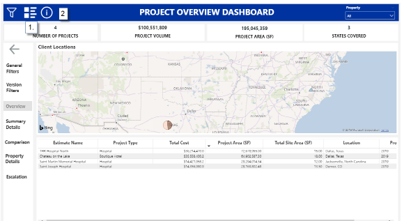
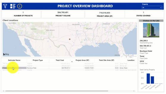
Overview Page
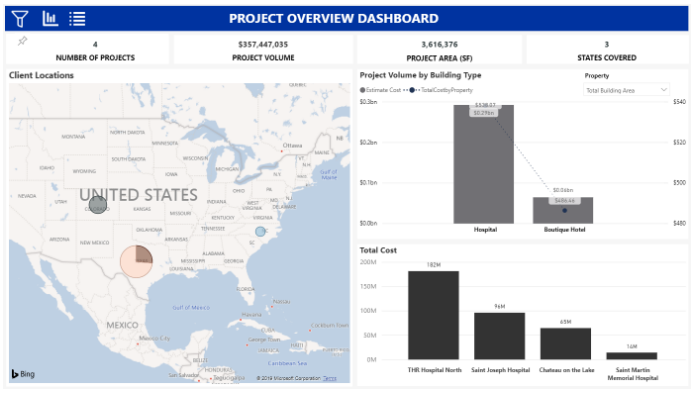
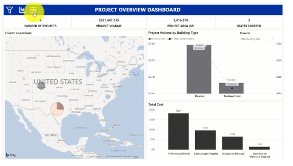
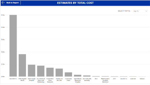
This is the starting page. It provides a high-level overview of your data. To minimize the side menu, you can click the arrow (1). (2) shows your estimates’ locations. The circles are based on the total cost of the work. (3) shows project volume and project volume per unit of a specified property. There is a slicer on the side of the graph so that you can choose the property. (4) is a graph of estimates based on the total cost. You can click “View More Estimates” to see a bigger version of this graph that contains all of your filtered estimates, rather than the top N.
General Filters
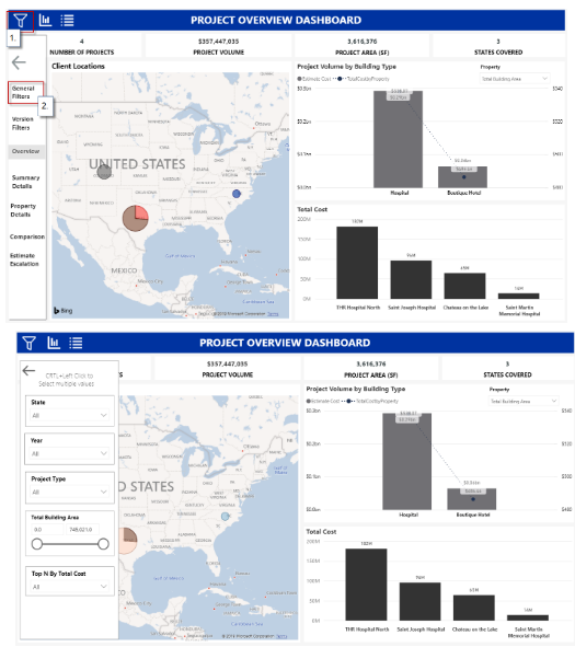
The right-hand column is a list of the different factors that you can use to determine which estimates are shown.
Version Filters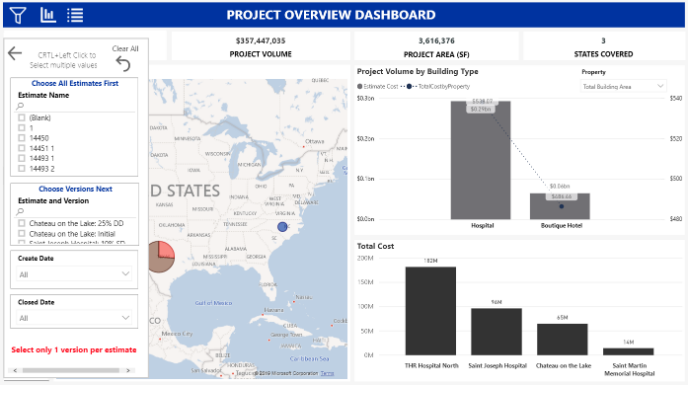
The right-hand column allows you to choose which estimates you want to see as well as the version. First, select all of the estimates you want to look at in the first slicer. Then, you can choose from the list of versions the one you want. If you select multiple versions for the same estimate, a warning will show up at the bottom of the column.
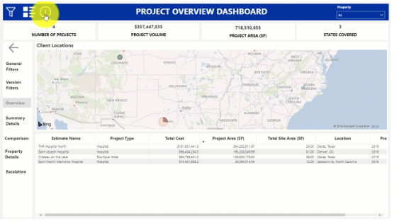
List View
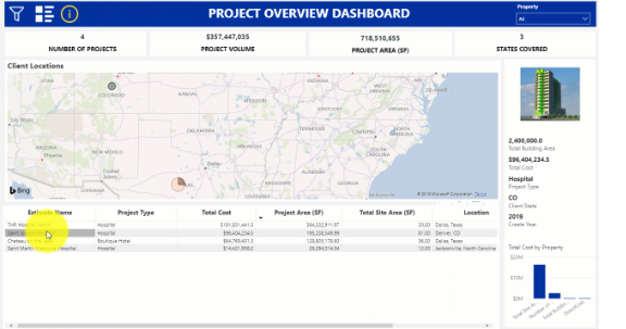
If you prefer viewing the data in a list view instead of as bar graphs, then you click on the List View icon. To navigate the List View Page, you can click on the Graph View icon(1) to return back to the Bar graph overview page. To view more details about each estimate, you can click on the More Information icon (2)and then click on the individual estimates. 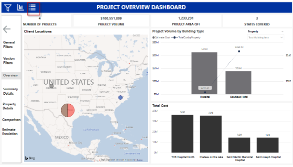
View More Estimates 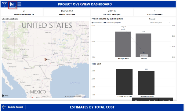
Summary Details Page

This shows more detailed information about each estimate (2) as well as a breakdown by WBS Property (3). In the top right-hand corner (1), there are two slicers: one to pick the WBS property to base the breakdown and one to make sure that all of the estimates are a similar type.
Property Details Page
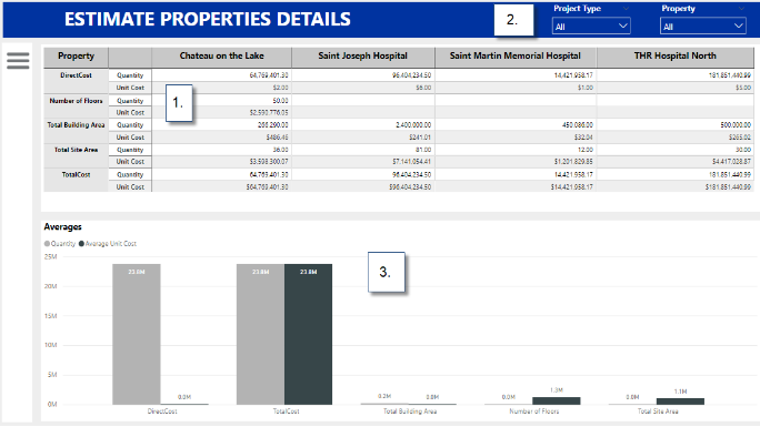
This dashboard shows the property values in more detailed information. For each estimate, you can see the quantity of that property, as well as the unit cost (1). (2), is a list of the available properties for you to select. There is also a graph of the average quantity and unit cost based on the property. (3)
Comparison Page
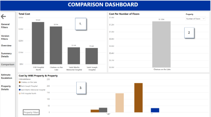
(1) shows the total costs and (2) is the cost per unit based on a property chosen in the slicer. (3) is the estimates separated out by WBS Property and shows the cost per unit based on a property. The slicers to choose the WBS Value and the Property are at the bottom of the graph.
Estimate Escalation Page
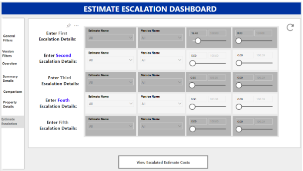
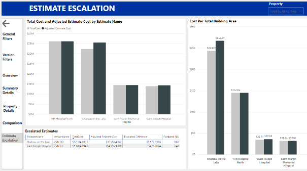
The escalation dashboard allows you to escalate up to 5 estimates and affects all of the other dashboards so that they reflect the escalated costs. You must select the estimated name, version, and escalation factors in order for the escalation to work.
As mentioned in the video above (6:30), you can set up the Yearly Cost Escalation Worksheet from this link.